

Color theory plays a pivotal role in web design, influencing user perception and decisions.
Understanding how color impacts emotions and behaviors can lead to more effective and engaging website designs.
Additive Color Model (RGB)
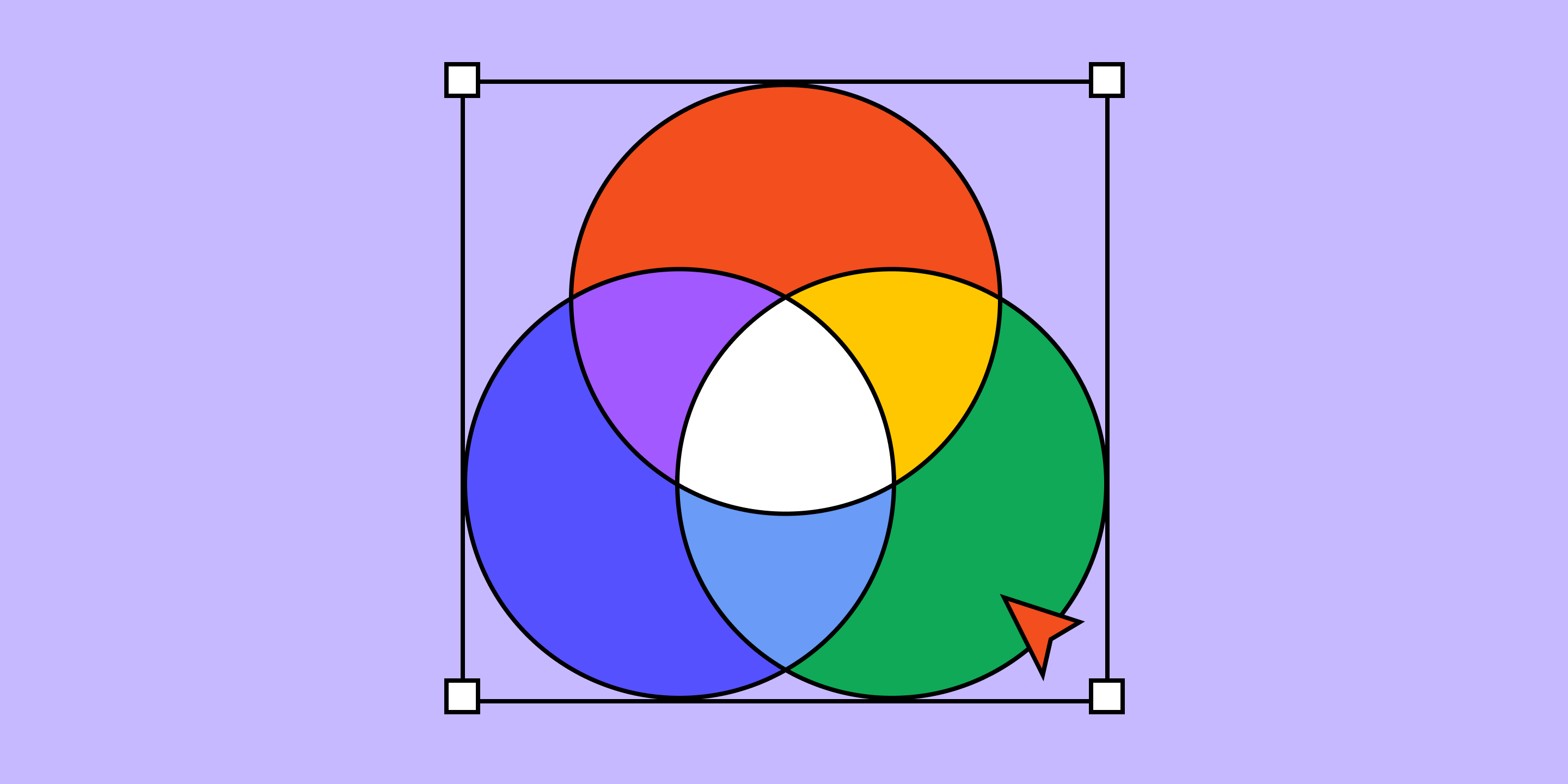
The Additive Color Model (RGB) is fundamental in digital design. It involves combining red, green, and blue light in various intensities to create a wide spectrum.
When all three are mixed at their highest intensity, the result is white light, while the absence of all three results in black. This model is used in digital screens, such as those on computers, smartphones, and televisions, because these devices emit light directly to the viewer.
In web design, RGB is crucial because it aligns with how screens display hues. Designers use RGB values to ensure hues appear correctly on digital interfaces.
For example, pure red in RGB is represented as (255, 0, 0), meaning full intensity of red with no green or blue. By adjusting these values, designers can create a wide array of hues that are consistent across different devices.
Understanding RGB helps web designers create visually appealing and accessible websites. It allows for precise control over hue outputs, ensuring that the design remains true to the intended aesthetic. This model is also essential for creating dynamic effects and gradients that enhance the user experience.
By mastering RGB, designers can manipulate hues to achieve the desired visual impact and maintain consistency across various digital platforms. This control is particularly important for branding, where exact hue representation is critical.
Additionally, RGB supports the creation of vibrant and engaging visuals that can attract and retain users’ attention, making it an indispensable tool in the web designer’s toolkit.
Subtractive Color Model (CMYK)

The Subtractive Color Model (CMYK) is primarily used in printing. It works by subtracting light using the colors cyan, magenta, yellow, and black (key). Unlike the RGB model, which adds light to create colors, CMYK removes varying degrees of light to produce the desired hues. When all colors are combined, they create black, which is why the black component is essential in the printing process.
In design contexts, it’s vital to distinguish between RGB and CMYK because each model serves different purposes. While RGB is used for digital screens, CMYK is critical for print materials like brochures, business cards, and posters. Understanding this distinction helps designers ensure their work looks as intended, whether on a screen or in print.
When designing for print, colors created in the RGB model may not translate accurately to CMYK. Therefore, designers often convert their designs to CMYK to preview and adjust colors accordingly. This process ensures that the final printed product maintains the desired color integrity and visual impact.
The Color Wheel and Its Basics
The color wheel is a foundational tool in understanding color relationships. It was first conceptualized by Sir Isaac Newton in the 17th century and has since become a staple in art and design. The wheel is divided into primary, secondary, and tertiary colors.
Primary colors—red, blue, and yellow—are the building blocks of all other colors. They cannot be created by mixing other colors and are fundamental in color theory.
By combining primary colors, we get secondary colors: green (blue and yellow), orange (red and yellow), and purple (red and blue).
Tertiary colors are formed by mixing a primary color with a secondary color, resulting in hues like red-orange or blue-green.
Understanding these categories helps designers create balanced and harmonious color schemes. For example, using a combination of primary, secondary, and tertiary colors can produce a visually appealing and cohesive design. Additionally, this knowledge aids in selecting colors that convey the desired emotional response and enhance user experience.
Warm vs. Cool Colors
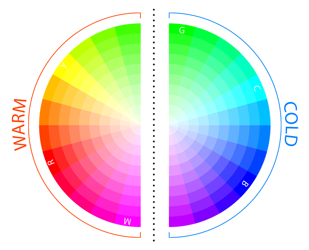
Colors can be broadly classified into warm and cool categories based on their psychological and visual effects. Warm colors, such as reds, oranges, and yellows, are often associated with energy, warmth, and excitement.
They can stimulate emotions and grab attention, making them suitable for calls to action or highlights in web design.
Cool colors, including blues, greens, and purples, evoke calmness, peace, and relaxation. These colors are often used to create a tranquil and soothing atmosphere, making them ideal for backgrounds or sections of a website that aim to convey trust and professionalism.
For instance, a website for a financial institution might use cool colors to instill trust and reliability, while a promotional site for a new product might use warm colors to generate excitement and urgency.
Color Variants and Their Effects
Hue refers to the pure color in the spectrum, like red, blue, or green. Shade, tint, and tone are variations of the base hue created by adding black, white, or grey, respectively. Adding black to a hue creates a shade, making the color darker.
Adding white produces a tint, lightening the color. Adding grey creates a tone, which can either darken or lighten the hue depending on the balance of grey added.
These variations allow designers to create depth and contrast within a color scheme. For instance, using different shades of blue can add dimension to a design without straying from the color palette. Similarly, tints can soften the overall look, making the design feel lighter and more airy.
Color Temperature

Color temperature refers to the warmth or coolness of a color, measured in degrees Kelvin. Warm colors, with lower temperatures, evoke feelings of warmth and comfort, while cool colors, with higher temperatures, create a sense of calm and serenity.
Understanding color temperature helps designers choose colors that evoke the desired emotional response.
For example, using warm colors in a call-to-action button can make it stand out and encourage user interaction. Conversely, cool colors in a background can provide a calming effect, making content easier to read and digest. By strategically using color temperature, designers can enhance user experience and guide user behavior effectively.
The Bottom Line
Understanding and applying color theory in web design is essential for creating visually appealing and user-friendly websites. Good color choices enhance user experience and strengthen brand perception, making them a vital aspect of effective design.


